Sunday, June 17, 2007

Stolen Moments


You were right all along, Nina... Iris Uy is herself the muse. She left a message on my blog last weekend, so you can just imagine how ecstatic I was (can you imagine my tail wagging all over the place? That's how thrilled I was!). Anyway, she got me so hyped up, I was able to finish this LO I scraplifted from Page Maps. Initially, it was the scallops that got me interested. Since I've been intending to try doing one for a long while, I decided to scraplift that section of the LO. The arrangement of the pps was from Becky Fleck's sketch. As for the rest of the inspiration, it was Iris-borne - hehehe.

Do feel free to critique my work. For once, I'd really like to hear what people honestly think can improve the subject LO. It may make you feel a bit uncomfortable telling me your opinion, but hey, if it will improve my work, wouldn't you like to help out? Thanks in advance to the brave ones who will step forward. I really appreciate your effort.

Hidden Journaling Reads: Being a working mother, I live a harried and stressful life. But for half an hour everyday… just before I set off to work, I get to have this window of opportunity to have my daughter all to myself. And for a brief moment, my daughter and I get lost in a world of ‘a-foo-foo’ (octopus), ‘e-pen’ (airplane) and ‘ebysees’ (ABC). We would either draw pictures or read a book. We also get to play hide and seek or sing and dance. I would make up short ditties and sing silly songs for her. She, on the other hand would clap at my senseless stories or do an interpretative dance to my tuneless racket. It is great to discover a captive audience during these stolen moments. And for a short instance, time really does stand still for the both of us.

Materials Used: BG Phoebe Sausalito pps; Telegraph Hill pps; The Presidio pps; Bazzill cs; Kelly Panacci stickers; Prima flowers; Stamp-N Stuff Embossing Tinsel (Copper); Tres Jolie Tres Bien “Play” Card.

Others: Brass embellishment; Swarovski crystals; white acrylic paint; Sizzix Funky Brush alphabet; cotton lace; mini-brads.

The Process: First, I used the pinking and mini-scallop decorative blade of the Carl trimmer to edge the Telegraph Hill and The Presidio pps, and adhered them to the Sausalito cs. Then, instead of matting the picture, I chose to distress the edges with acrylic paint. Before liberally swiping the foam brush on edges of the picture, I dabbed it several times on a dry tissue to take off majority of the acrylic paint. This is to give the picture that weathered yet dreamy soft edges.

After which, I moved on to estimate the area to be covered by the scrolls and cut a 4”x12” Bazzill cs. Then I lightly sketched the scrolls free-hand using a pencil. It is okay to have the initial sketch uneven after all, it is simply a guide and you can later smooth out the edge when you cut it with a pair of scissors. Since I will later be covering the scrolls with embossing tinsels (copper), I intentionally drew and cut the swirls in three separate sections (you can do four if you feel it will make it easier for you to handle).

You need not worry if the three edges do not meet perfectly because it will later be covered by the big Prima flower. After cutting them out, I started with the smallest scroll and dabbed it in the clear embossing pad. Next, I sprinkled the embossing powder and melted it with the heat gun. On the first pass, majority of the embossing tinsels were blown away by the heat gun leaving patches of unevenly melted sections on the cardstock. Since I thought I already ruined it, there was no harm in making it any worse and repeated the process like I would do with a UTEE. Surprisingly, the second layer of embossing powder adhered better on the scroll. Perhaps because the embossing pad liquid were not absorbed by the smoothed out surface of the embossed cs. I did the same on the remaining two sections of the swirl but I noticed that the biggest one needed a third layer. It was a great discovery for me that if I make a mistake on one layer, I can just continue heating it with the gun and prayed that the next layer will make it look better, which it did. By the way, I found it better for me to melt the powder if I laid the scrolls flat on a magazine or folded newspaper. That way, I can protect the surface of my working area from any stray melted powders.

Next, I used the Sizzlits Funky Brush die to spell out the title and individually embossed the letters with the same embossing powder. Since the letters were much smaller than the scrolls, they were blown away by the strong heated air of the gun. To hold them in place, I used a pair of long-handled tweezers (not to pin them down but) as a wedge along both side the letters so when I apply the strong heated air, the small letters may move a little but will not be blown or tipped over by the gun. As with the scrolls, I noticed that the letters too needed at least two to three applications of the embossing powder. Now here’s a tip, it is better to position the heat gun directly downward. That way, the strong air will push the scrolls or letters towards the newspaper and not blow it sideways. I must also inform you to expect light smoke to emanate from the melting powder and just glide the gun slowly to the next area as soon as you see the powder turn shiny.

After almost giving up from the tedious effort of individually embossing the letters, I gladly moved on to cutting the 4” diameter Prima flower in half. I used one to cover the ends of the sectioned scrolls. The other half I adhered to the top section of the Tres Jolie Tres Bien “Play” Card which contains my journaling. But first, I cut the top section of the card to follow the stamped design and glued two sizes of Swarovski crystal on selected ends of the swirl design. Then I glued the picture on the base pps and slid the card underneath the top section of the picture. Finally, I cut the cotton-lace to size and pinned them to the pps using mini-brads as a finishing touch.

Now here’s the most important part: After gluing all the components and embellishments together, allow yourself to do your very own version of “The Jig” as you sway towards the ref for a much-deserved can of coke or chunk of chocolate. Do not forget, too, to pat yourself at the back between each swigs of coke or bites of delicious chocolate. Then you can go ahead and call your best friends to brag about your newest LO.

Monday, June 11, 2007

Cousins


During the weekend, I visited the online album of Iris Uy just to see her new LOs. Halfway through, I was already in awe and a pang of self-pity was creeping in. By the time I finished, I was muttering to myself: “My LOs looks like Sugar-Honey-Iced-Tea. I know nothing… nothing!” Her album definitely has a humbling effect on me and I was left questioning my capability as a scrap booker. That night, I decided to do an LO but my muse had abandoned me altogether. She must have been driven out in shame by Iris’ work of arts. I sat for 2-1/2 hours staring at the picture I have printed earlier and the papers I have chosen the day before. Nothing came to me. I looked up at the wall clock and it said 12 midnight, and I haven’t even cut a piece of paper yet. Finally I said to myself: “Oh heck, you’re not as good an artist as Iris, but who’s to stop you from getting inspirations from her work.” So I cut the first piece of paper to commit myself.

I noted that Iris has this fondness for putting a bunch of flowers on one corner of the photo so I decided to duplicate that. She’s also fearless about using a dark background and I decided to experiment on that as well. The outcome is nothing close compared to hers, but it’s mine. And for now, I’ll have to be content with that. But it wouldn’t stop me from continuing to aspire and practice (a whole lot) so at least my LOs would look less of a Sugar-Honey-Iced-Tea next to hers. Thank you for the inspiration Iris. I only wish I’d be half as good as you in the future.


Hidden Journaling Reads: I just love this picture of you with your favorite cousin, Nadia. It clearly shows how much you enjoy her company. Now, mind you, your Di-Tsi Nadia is an imp and she just loves toying with you – but you never seem to mind. I guess deep down inside you know she adores you and you are only too happy to do what she asks.

Materials Used: Bazzill cs; Kaleidoscope “Make A Wish” pps; Kaleidoscope “Princess” Flower pps; Craft Express Glitter Stickers; Kimberly Hodges Embossed Stickers; 7 Gypsies Happiness Card.
Others: Kulascel Ultimate Circle; MM Brads; Ribbon; Sizzlits Roundabout alphabet; Colorbox Chalk Ink.

Tuesday, June 5, 2007

Sweetheart


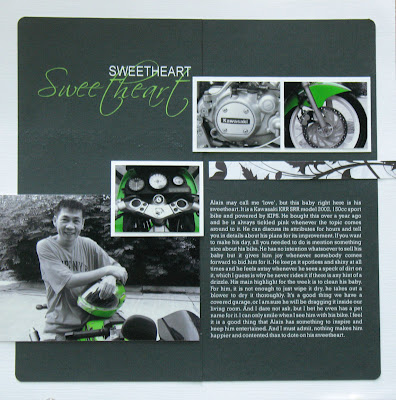
I have to say, this month’s PS challenge left me stumped for days. On top of which, my husband has been bullying me to do a lay-out of his ‘sports’ bike. He refuses to have it called a motorcycle (eyes rolling). Eventually, when the idea came to me, it was so simple to execute. For the title, I intentionally chose a mushy theme so that when people see it and my husband they would automatically connect the two. Until you read the journaling, that is.

Journaling Reads: Alain may call me ‘love’, but this baby right here is his ‘sweetheart’. It’s a Kawasaki KRR SSR model 2002, 150 cc sport bike and powered by KIPS. He bought this over a year ago and he is always tickled pink whenever the topic comes around to his it. He can discuss its attributes for hours and tell you in details about his plans for its improvement. If you want to make his day, all you needed to do is mention something nice about his bike. He has no intention whatsoever to sell his baby but it gives him joy whenever somebody comes forward to bid him for it. He keeps it spotless and shiny at all times and he feels antsy whenever he sees a speck of dirt on it, which I guess is why he never rides it if there’s any hint of a drizzle. His main highlight for the week is to clean his baby. For him, it’s not enough to just wipe it dry. He takes out a blower to dry it thoroughly. It’s a good thing we have a covered garage, or I’m sure he’ll be dragging it inside our living room. And I dare not ask, but I bet he even has a pet name for it. I can only smile when I see him with his bike. I feel it’s a good thing that Alain has something to inspire and keep him entertained. And I have to admit, nothing makes him happier and contented than to dote on his sweetheart.

Materials Used: White Bazzill CS; Rouge de Garance Cupidon PPS; CorelDRAW Graphic Suites X3; Adobe Photoshop CS2.
Fonts Used: Scriptina and Arial (title); Rockwell (Journaling).

The Process: I used the magic wand tool in Photoshop to mask segments of the picture I want to retain colored, then inversed the selection and converted the rest of the picture in black and white. I attained this by adjusting the hue and saturation to zero. Then I used CorelDRAW to crop and size the pictures before printing them out. I also used Corel to reverse print the title and journaling in white Bazzil CS. Since my printer can only accommodate a maximum size of 8” width paper, I had to cut the Bazzil CS to 6” and printed the journaling on one panel and the title on the other one. The next problem was putting the two back together without making the joint obvious. To detract attention from the joint and draw it towards the picture, I matted the photos in white CS. When placed on top of the black background, the matted photo gave a dramatic impact that you’ll hardly notice the line cutting across on top of the LO. As for the joint on the middle part, I camouflaged it behind the 4x6 picture and small matted photo. When I stepped back to view the end result, I found it too stark and masculine. I thought I needed something to soften it up a little and balance the flourish of the Scriptina font. I achieved this by cutting a ½” strip of Rouge de Garance pps and using it as a finishing touch above the journaling. Inasmuch as I am tempted to put in more embellishment, I have to draw myself back and leave it as it is. By the way, I am not in the least techno savvy, I have my bestfriend Au to thank for teaching me the ropes on Corel and Photoshop.

Sunday, June 3, 2007

The Difficult Process

Thank you Lee, Christine, Ella and Jenn for your heart-warming comments. Lee was actually looking for the process of my last LO. I tried holding it back so as not to let anyone know how clumsy I am when it comes to scrapping. But since you liked it, you gave me enough courage to spill the beans, so to speak.

First of all, it is no secret that I am a confessed scrap lifter. I got the inspiration of my last LO from an article of Renae Clark in Memory Makers’ magazine February 2007 issue. What everyone doesn’t know though is that I’m notoriously stingy when it comes to my scrapbook materials. Just to show you how far gone I am about this quirky habit, look at the back of my LO (see left). I know, I’m just making life difficult for myself but I do find thrills in saving up scraps for my next project. They do call this hobby ‘scrap’ booking, right?

Moving on to my confession: After cutting out and setting aside all the sections which are supposedly covered by the other pps, I get over-zealous to re-assemble the pieces back together. Which leads me to a recurring pitfall: Due to my eagerness, I usually forget to distress or ink the edges of the pps. By the time I realize it, the pieces are permanently stuck together. Being used to this dilemma, I quickly go into what I call my let’s-see-you-get-yourself-out-of-this-mess mode.

My usual solution for this blunder is to tape the sides of the cs I wish to protect from the ink. But before sticking the magic tape to the cs, I run it through my clothes several times so as to make it less tacky. Since I cannot swipe the stamp pad, I use a dabbing motion to slowly ink the side of the pps. Using the pointed tip of the Petal Point Colorbox stamp pad, I do a finishing swipe on the outermost edges to make it darker. I then remove the tape and do a little dance of joy for yet another successful recovery.

Now for this particular LO, no sooner had I taken myself out of a sticky situation, I quickly jumped in to another one. I had this bright idea to use the reverse side of the Scrapbook Walls plaid pps as a matt for my photo. So I went and cut the matt from my LO ‘horizontally’. Only to realize later that when I re-attach the matted photo ‘vertically’, there would be a 1-1/2” gap on the side. (Doh!)

It’s a good thing I remembered that I have some mulberry paper. It was a gift from my sister over 5 years ago when I initially started scrap booking. I never got the nerve to use it till now so I was amazed at how easy it was to use. All I did was cut it to size, wet the edges and pinched off the wet section, leaving a softly, frayed edges.

I then move on to attach my big prima flower. While adjusting the ribbon, I was again struck with a bright idea: Why not cut off two petals on each side of the flower? This way, the ribbon can lay flat on the paper. Without thinking much about it, I snipped off the petals. (Double-Doh!) The ribbon did lay flat but the flower looked really odd. It’s a good thing I was able to re-attach the petals and simply hid my mistake behind a chipboard tag.

Now, mind you, not all of my boo-boos are entirely my fault. Sometimes it was purely bad luck. As is the case with the rub-ons unintentionally sticking smack, right center on the glued photograph. I tried using magic tape to pick up the renegade rub-on but I only ended up pushing it in and ruining my glossy picture (Oh, man!).

I eventually decided to reprint my photograph. By now, Murphy’s Law was going on overtime: I somehow cropped the picture 1/4 of an inch smaller than the original one, so I cannot overlap it onto the ruined photo (Aarrrgh). Good thing I had a spark of inspiration from CH Herrin. I tilted the photo and made it seem like I intentionally planned all along to super-impose the 2 identical pictures (Whew! Thanks CH).

Tired yet rejuvenated by the sight of a finished LO, I reflected on what I went through. On hind-sight, I believe it is a good thing I made all these mistakes because, one, I got to discover new techniques for distressing (not just myself but the paper, as well). Two, I was forced to use my mulberry paper. Three, I got creative in order to hide all my mistakes – and best of all, my LO looked better than I initially intended it to be. Now, isn’t that a happy ending?